On working with experiences where emotion is not a layer, but the material
In one of my recent projects, I unexpectedly found myself in a situation that almost no commercial product experience really prepares you for.
It was a digital experience whose success depended not on metrics, funnels, or scenario optimization, but on how precisely and consistently the user moved through a predefined emotional trajectory. The emotional dimension here did not support functionality or “enhance UX”, it was the primary design material.
For me, with more than fifteen years of experience in service and UX design, this required a radical shift of focus. For the first time, the product could not be described through a feature set, a CJM, or a value proposition. It had to be thought of as a temporal, sensory, and cognitive process unfolding inside the user’s consciousness.
Emotion as a design environment
In most product teams, emotion exists as one layer among others: we talk about “pleasantness,” “trust,” or “engagement.” Here, things were fundamentally different. We were not designing individual emotions, but an emotional field within which the user gradually moves.
This meant abandoning the habitual logic of “removing friction and irritants.” On the contrary, barriers, system resistance, overload, or acceleration became instruments.
For example:
- a delayed system response could create a sense of weight and concentration;
- overly fast text could generate mild stress and tension;
- the absence of immediate feedback could evoke uncertainty and loss of control.
These states were used deliberately, in order to later guide the user through contrast toward relaxation, clarity, or inspiration. In its logic, this approach is much closer to dramaturgy and directing than to classical UX practice.
Time as a design material
Another major insight was working with time.
Not simply asking whether text is readable, but what psycho-emotional effects speed itself produces:
- slow pacing reduces cognitive noise;
- acceleration increases tension and focus;
- pauses intensify anticipation and reflection.
At some point it became clear that the timing of text, animation, sound, and interaction is as much a design material as color or form. We were literally designing the rhythm of experience, not separate screens as we usually do.
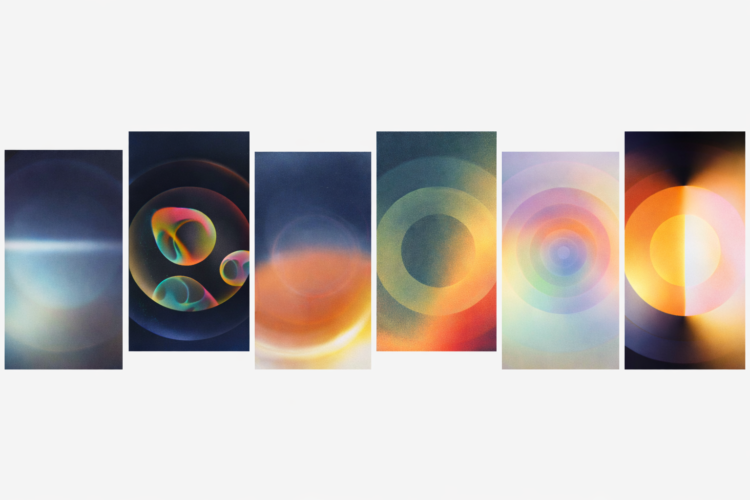
Color, form, and sound as cognitive stimuli
Visual and auditory decisions in this project were not driven by aesthetics. They were grounded in cognitive science, neuroscience, and research on attention and perception.
Color, shape, contrast, texture, and sound were treated as active stimuli influencing:
- arousal level,
- attentional distribution,
- feelings of safety or anxiety,
- readiness for reflection.
As a result, design stopped being “decoration.” It became a way of regulating mental state.
Transparency and synchronization
At the same time, the deeper we went into emotional design, the more critical basic UX principles became.
If a system:
- does not provide clear feedback,
- does not synchronize the user’s attention with what is happening,
- does not make interaction expectations intuitive,
— any emotional effect collapses instantly.
In experiences of this kind, transparency and intuitiveness are no longer about convenience. They are about trust and psychological safety. The user must feel that the system “holds” them, even when it intentionally introduces tension or resistance.
A methodological shift
To defend design decisions and avoid slipping into subjective “like / dislike,” we had to build our work on a solid scientific foundation. We analyzed dozens of studies across neuroscience, perception, attention, and emotion, while also transferring tools from narrative disciplines — literature, theater, cinema — into digital product design.
The result was a hybrid methodology where:
- emotions are designed with the same rigor as functions;
- the user journey is described through emotional vectors rather than screens;
- barriers and tension become controllable elements of experience.
Why do I think it matters
Such projects are rare. They usually emerge at the intersection of art, science, and technology. But they clearly expose the limits of conventional product thinking.
When emotion stops being a CJM layer and becomes the primary material, everything changes: language, tools, quality criteria, and the designer’s role.
And perhaps this is where the next step of our profession lies — beyond optimization, metrics, and familiar frameworks.
I am still in the process of formalizing this experience. For now, I see it as a rare opportunity to look at product design from another angle — one where the focus shifts from efficiency to experience, and working with users becomes working with states.
I welcome discussion and disagreement. As this project itself demonstrated, it is precisely in zones of friction that new understanding emerges.